Activity & Load Trends
The Activity & Load tab visualizes how your PostgreSQL instance's workload intensity has evolved over the selected time period. It combines transaction throughput, session activity, DML operations and contention indicators into a single view.
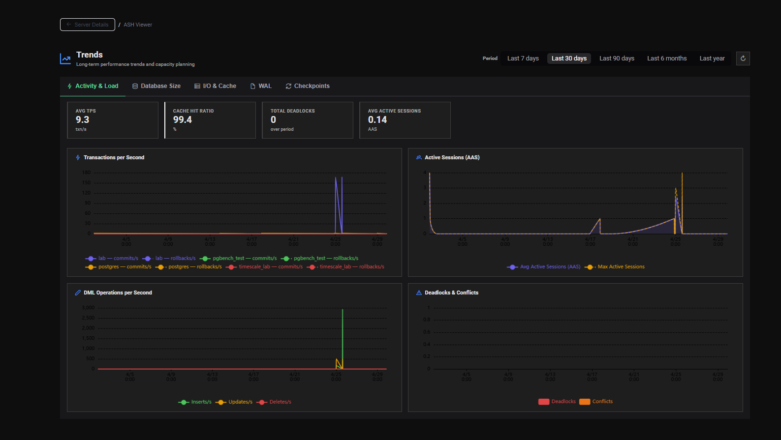
KPI Summary Cards
Four summary cards display period-wide averages at the top of the tab:
| Card | Unit | Description |
|---|---|---|
| Avg TPS | txn/s | Average transactions per second over the selected period |
| Cache Hit Ratio | % | Average buffer cache hit ratio — color-coded by severity |
| Total Deadlocks | count | Total number of deadlocks detected over the period — highlighted red if > 0 |
| Avg Active Sessions | AAS | Average number of concurrently active sessions over the period |
Cache Hit Ratio Severity
| Value | Color | Meaning |
|---|---|---|
| ≥ 95% | 🟢 Green | Excellent cache efficiency |
| 90–95% | 🔵 Blue | Good — acceptable |
| 80–90% | 🟠 Orange | Warning — notable disk reads |
| < 80% | 🔴 Red | Critical — investigate |
Charts
The tab displays 4 charts in a 2×2 grid, each showing the evolution of a specific metric over the selected time range.
Chart 1 — Transactions per Second
A line chart showing TPS (committed + rolled-back transactions per second) over time.
Use for:
- Identifying workload peaks and off-peak periods
- Detecting organic TPS growth over weeks or months
- Correlating TPS drops with incidents or maintenance windows
- Capacity planning — projecting when current infrastructure will reach its TPS limit
Chart 2 — Active Sessions (AAS)
A line chart showing the Average Active Sessions over time.
Use for:
- Tracking how database concurrency evolves over time
- Identifying sustained high-load periods that may require infrastructure scaling
- Correlating AAS spikes with specific workloads or incidents
- Validating that a deployment or configuration change reduced session concurrency
AAS approaching the number of available CPU cores indicates that sessions are competing for CPU resources. Monitor this trend to anticipate when additional CPU capacity will be needed.
Chart 3 — DML Operations per Second
A line chart showing the rate of INSERT, UPDATE and DELETE operations per second over time.
Use for:
- Tracking write workload intensity over time
- Identifying write-heavy periods that may stress autovacuum and WAL generation
- Detecting unexpected spikes in DML activity (e.g. a runaway batch job)
- Correlating DML growth with database size growth (see Database Size tab)
Chart 4 — Deadlocks & Conflicts
A bar or line chart showing the number of deadlocks and query conflicts over time.
Use for:
- Detecting periods of increased lock contention
- Identifying whether deadlocks are a recurring pattern or a one-time event
- Correlating deadlock spikes with deployments or application changes
- Monitoring replication conflicts in standby-heavy environments
A non-zero deadlock trend over time indicates a systemic locking issue in the application. Investigate with the Lock Contention Analysis section of the AWR Viewer for the affected time period.
Interpreting Trends Over Time
Organic Growth
A gradual, proportional increase in TPS, AAS and DML reflects natural workload growth — use this for capacity planning projections.
Sudden TPS Drop
A sharp drop in TPS may indicate an outage, a maintenance window or a connection pool exhaustion event. Cross-reference with the ASH Viewer for the same time window.
Rising AAS Without Rising TPS
Sessions are becoming slower — each transaction takes longer to complete. Investigate lock contention, I/O saturation or CPU competition. Check the AWR Viewer for a snapshot covering the affected period.
Declining Cache Hit Ratio Trend
The working dataset is growing beyond shared_buffers capacity. Plan a memory upgrade or review queries generating large sequential scans.